TU Delft Campus
TU Delft's campus is home to some of the most forward-thinking research labs in the Netherlands. Each one distinct in focus, audience, and purpose yet all sharing the same institutional roof.
The challenge wasn't designing a website. It was designing a system that could hold nine of them together without flattening what makes each one its own. The inconsistency between the existing sites was the starting point. The design system was the answer.
DELIVERABLES
Website
Flexible template
Role
Senior Designer
Client
TU Delft campus
Year
2026

I joined the project at the wireframing phase, stepping into a process that had already mapped the structural bones of the system. From there, my work as UX/UI Designer was to translate that architecture into a coherent visual language — one flexible enough to serve a campus navigation tool, a robotics fieldlab, and everything in between, while giving each site the identity it needed to communicate credibly to its own audience.

The problems were layered. On the surface, the inconsistency was visual, each site looked and felt like it belonged to a different organisation. But underneath that was a structural issue: a fragmented CMS setup that made managing nine websites in parallel a significant operational burden. Every update, every content decision, happened in isolation. There was no shared foundation to build from.
The design brief, then, was as much about coherence as it was about control. Creating a system that multiple teams, with different levels of digital experience, could actually use and sustain over time.

The design system was built around approximately 30 components but the number is almost beside the point. What mattered was how each component behaved. A quick-links block could hold anywhere from one to six tiles. The main hero came in four versions: one built for video without sacrificing legibility, one for a full brand image, and two colour variants for teams working with less visual content. The logic throughout was the same, constrained enough to guarantee quality, open enough to accommodate very different content realities across nine sites.
This distinction between flexible and infinite was deliberate. With high staff rotation common in academic institutions, a system with too many degrees of freedom tends to degrade over time. Components needed guardrails built in, not imposed by a style guide nobody would read.


The choice to work with a fully open page composition model rather than fixed templates was not without tension. The concern was practical: organisations with frequent staff changes and evolving content ownership can struggle to maintain coherence when editors have unlimited freedom. A page that looks considered on day one can look chaotic by year two.
That said, the reasoning from the lead PM was sound. Several labs were still in early stages of defining their content, some were newly establishing an online presence for the first time, and locking down layouts before the content strategy was fully resolved would have created more problems than it solved.
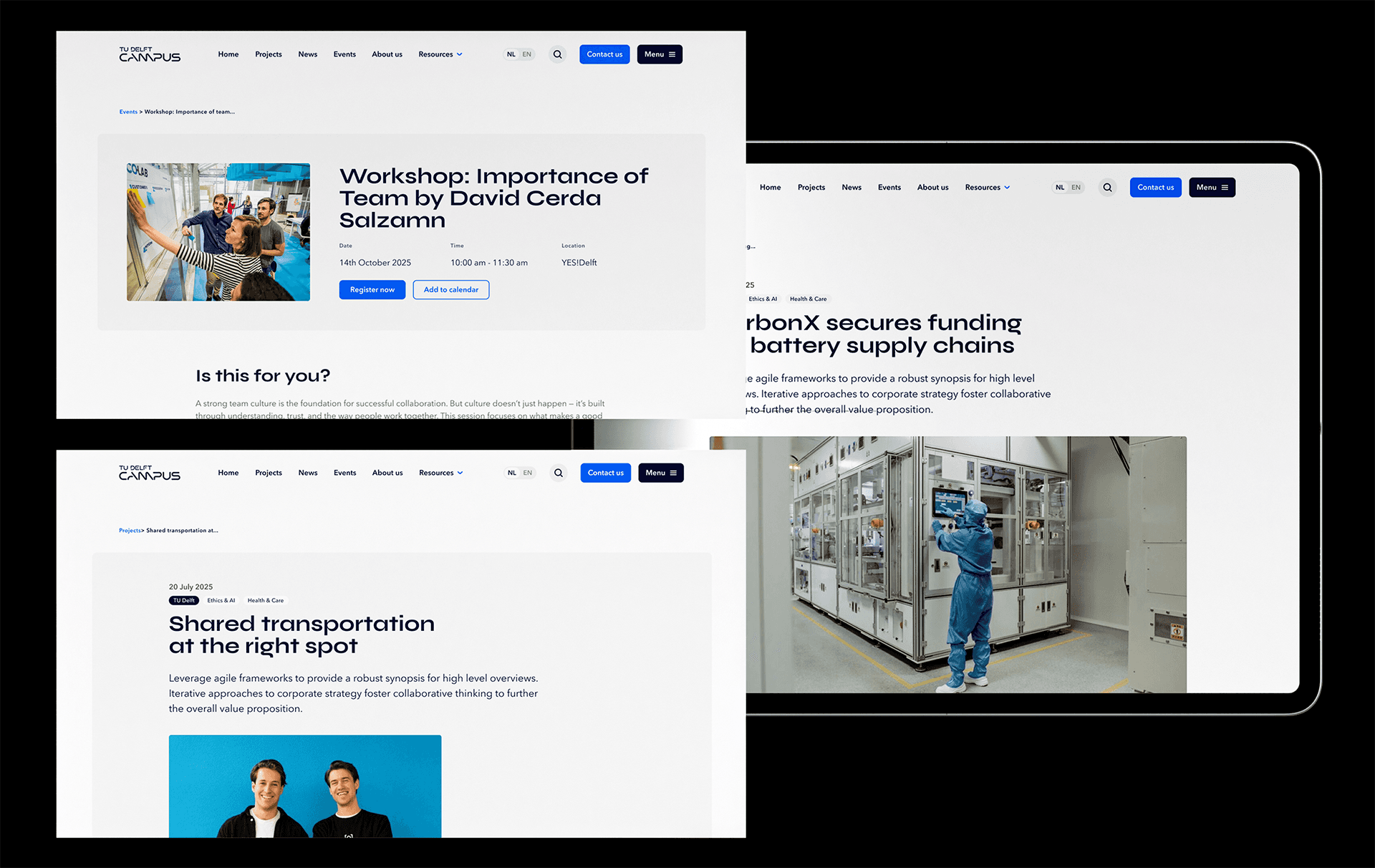
The middle ground was to make the possibilities visible and legible. We ran a dedicated design round using TU Delft Campus, the most content-complete site as a reference, mapping out realistic page compositions in each lab's own branding. We also developed content rhythm guidance: how to sequence image, text, pull quote, references and promotional strips in a way that maintains scannability and moves a reader toward a clear outcome, whether that's understanding a research project, finding a collaborator, or making contact.
The system doesn't enforce structure. But it shows what good structure looks like — and that distinction matters when the people building pages change.
Agency
Eagerly
Special Thanks
Leonie versteeg
Beyond the deliverables, this project reinforced something worth naming: designing for institutions means designing for change. Staff rotate, priorities shift, content evolves. A system that only works when the right people are in the room is not really a system. The goal here was something more durable than that.